Customize the Checkout Screens
We prepared two ready-to-use styles for checkout screens. You can define your own appearance from one of the default themes and apply the attributes you want to customize.
iOS
Mobile SDK provides two ready to use styles:
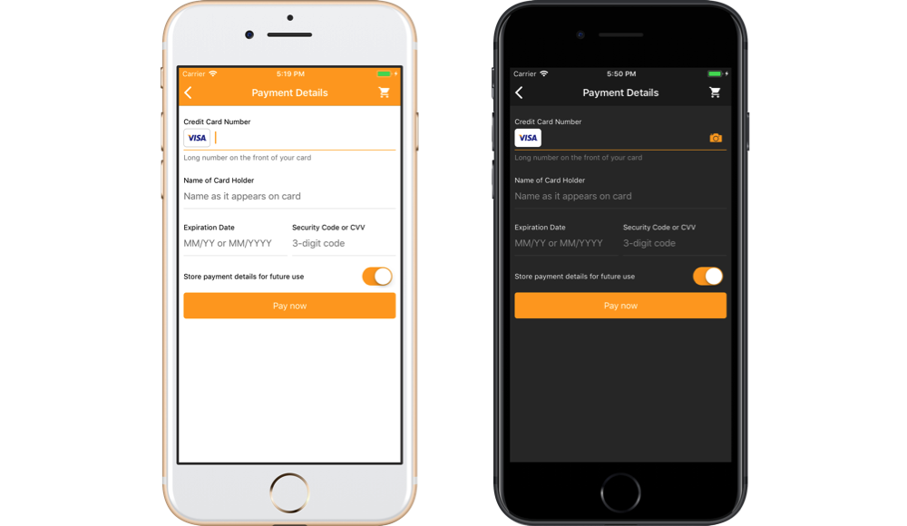
- Light theme - (
OPPCheckoutThemeStyleLight) - default - Dark theme - (
OPPCheckoutThemeStyleDark)
You can set one of the default themes and override some properties:
OPPCheckoutSettings *settings = [[OPPCheckoutSettings alloc] init];
settings.theme.style = OPPCheckoutThemeStyleLight;
settings.theme.confirmationButtonColor = [UIColor greenColor];
let settings = OPPCheckoutSettings()
settings.theme.style = .light
settings.theme.confirmationButtonColor = UIColor.greenSee below the list of properties you can customize and how they change the checkout UI:
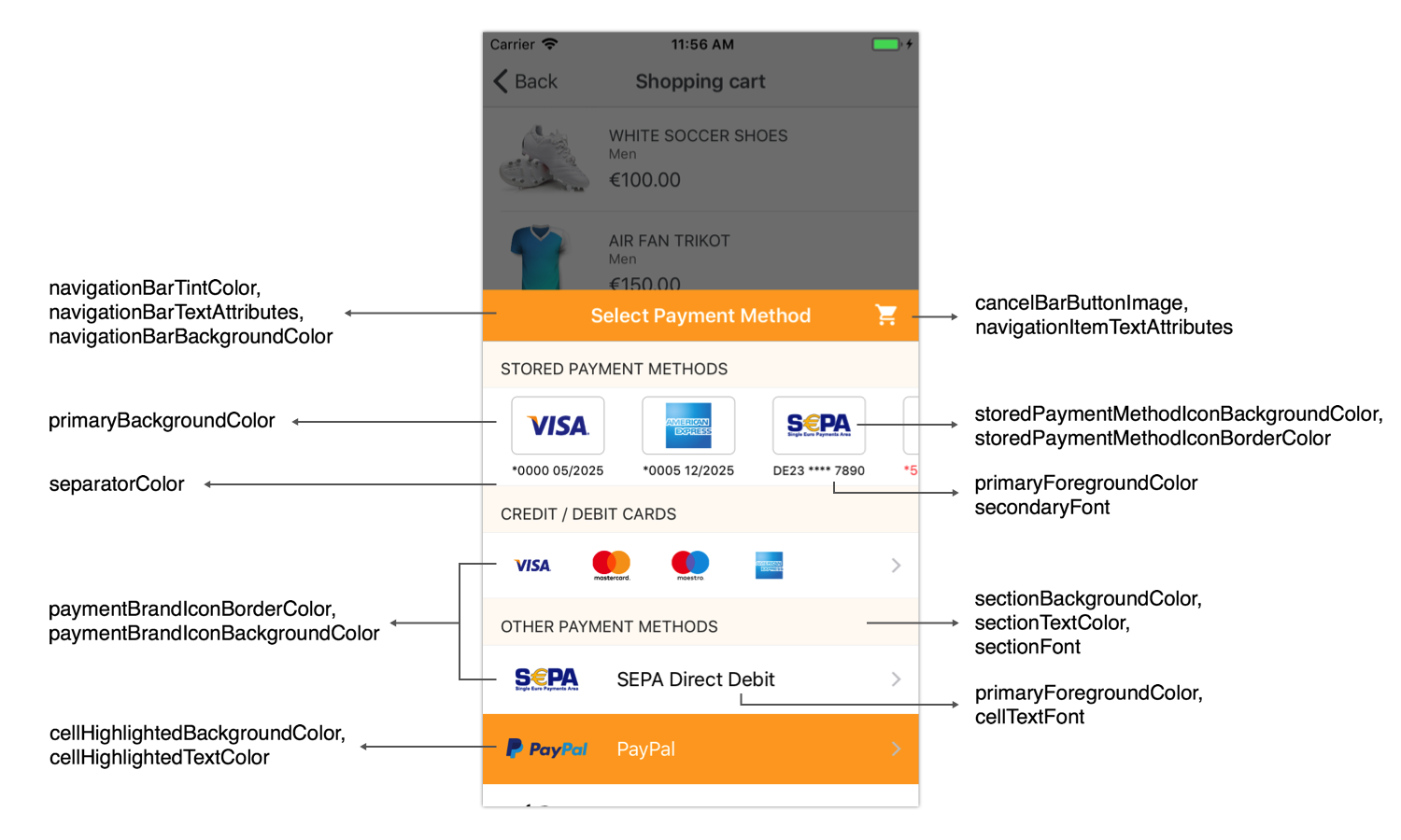
| Attribute Name | Type | Description |
|---|---|---|
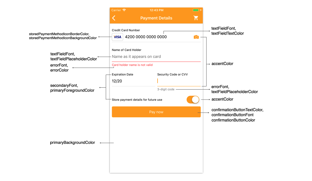
| primaryBackgroundColor | UIColor | Background color for any views in this theme |
| primaryForegroundColor | UIColor | Text color for any important labels in a view |
| textFieldBackroundColor | UIColor | Background color of text fields |
| textFieldTextColor | UIColor | Input field text color |
| textFieldPlaceholderColor | UIColor | Placeholder color for text fields |
| confirmationButtonColor | UIColor | The color of the confirmation buttons |
| confirmationButtonTextColor | UIColor | Text color for confirmation buttons |
| sectionBackgroundColor | UIColor | Background color of section |
| sectionTextColor | UIColor | Text color of section title |
| cellHighlightedBackgroundColor | UIColor | Highlighted background color for cell in the table view - payment brands list |
| cellHighlightedTextColor | UIColor | Text label highlighted color |
| cellTintColor | UIColor | Tint color for cell in the table view |
| separatorColor | UIColor | Color for separator lines |
| paymentBrandIconBackgroundColor | UIColor | Background color for payment brand icons |
| paymentBrandIconBorderColor | UIColor | Border color for payment brand icons |
| storedPaymentMethodIconBackgroundColor | UIColor | Background color for stored payment method icons |
| storedPaymentMethodIconBorderColor | UIColor | Border color for stored payment method icons |
| errorColor | UIColor | Color for rendering any error messages or views |
| primaryFont | UIFont | Text font for any important labels in a view |
| secondaryFont | UIFont | Text font for any other labels in a view |
| confirmationButtonFont | UIFont | Text font for confirmation button |
| sectionFont | Font of section title | Text font for cell on the table view |
| cellTextFont | UIFont | Text font for cell on the table view |
| errorFont | UIFont | Text font for rendering any error messages |
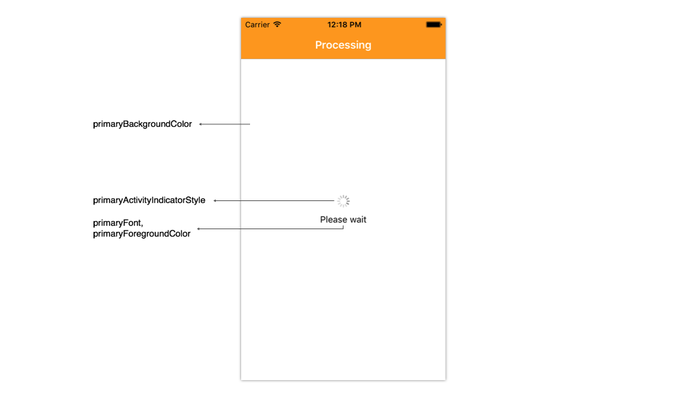
| activityIndicatorPrimaryStyle | UIActivityIndicatorViewStyle | Indicator view processing style |
| navigationBarTintColor | UIColor | Navigation bar tint color |
| navigationBarBackgroundColor | UIColor | Navigation bar background color |
| navigationBarTextAttributes | NSDictionary | Text attributes for navigation bar title |
| navigationItemTextAttributes | NSDictionary | Text attributes for navigation bar item titles |
| cancelBarButtonText | NSString | Custom text for the right bar button in the navigation bar Localized text is expected SDK is NOT localizing this text. Default value is "Cancel" |
| cancelBarButtonImage | UIImage | Custom image for the right bar button in the navigation bar If image is not set, text button is shown (cancelBarButtonText) |
OPPCheckoutSettings *settings = [[OPPCheckoutSettings alloc] init];

// General colors of the checkout UI
settings.theme.primaryBackgroundColor = [UIColor whiteColor];
settings.theme.primaryForegroundColor = [UIColor blackColor];
settings.theme.confirmationButtonColor = [UIColor orangeColor];
settings.theme.confirmationButtonTextColor = [UIColor whiteColor];
settings.theme.errorColor = [UIColor redColor];
settings.theme.separatorColor = [UIColor lightGrayColor];

// Navigation bar customization
settings.theme.navigationBarTintColor = [UIColor whiteColor];
settings.theme.navigationBarBackgroundColor = [UIColor orangeColor];
settings.theme.navigationBarTextAttributes = @{NSForegroundColorAttributeName: [UIColor whiteColor]};
settings.theme.navigationItemTextAttributes = @{NSForegroundColorAttributeName: [UIColor whiteColor]};
settings.theme.cancelBarButtonImage = [UIImage imageNamed:@"shopping_cart_black_icon"];

// Payment brands list customization
settings.theme.cellHighlightedBackgroundColor = [UIColor orangeColor];
settings.theme.cellHighlightedTextColor = [UIColor whiteColor];

// Fonts customization
settings.theme.primaryFont = [UIFont systemFontOfSize:14.0];
settings.theme.secondaryFont = [UIFont systemFontOfSize:12.0];
settings.theme.confirmationButtonFont = [UIFont systemFontOfSize:15.0];
settings.theme.errorFont = [UIFont systemFontOfSize:12.0];
let settings = OPPCheckoutSettings()

// General colors of the checkout UI
settings.theme.primaryBackgroundColor = UIColor.white
settings.theme.primaryForegroundColor = UIColor.black
settings.theme.confirmationButtonColor = UIColor.orange
settings.theme.confirmationButtonTextColor = UIColor.white
settings.theme.errorColor = UIColor.red
settings.theme.activityIndicatorStyle = .gray;
settings.theme.separatorColor = UIColor.lightGray

// Navigation bar customization
settings.theme.navigationBarTintColor = UIColor.white
settings.theme.navigationBarBackgroundColor = UIColor.orange
settings.theme.navigationBarTextAttributes = [NSForegroundColorAttributeName: UIColor.white]
settings.theme.navigationItemTextAttributes = [NSForegroundColorAttributeName: UIColor.white]
settings.theme.cancelBarButtonImage = UIImage(named: "shopping_cart_black_icon")

// Payment brands list customization
settings.theme.cellHighlightedBackgroundColor = UIColor.orange
settings.theme.cellHighlightedTextColor = UIColor.white

// Fonts customization
settings.theme.primaryFont = UIFont.systemFont(ofSize: 14.0)
settings.theme.secondaryFont = UIFont.systemFont(ofSize: 12.0)
settings.theme.confirmationButtonFont = UIFont.systemFont(ofSize: 15.0)
settings.theme.errorFont = UIFont.systemFont(ofSize: 12.0)
Android
The Checkout project uses styles to customize UI. A style is a collection of properties that specify the look and format for a View or window. A style can specify properties such as height, padding, font color, font size, background color, and much more. A style is defined in an XML resource that is separate from the XML that specifies the layout.
The Checkout project provides two ready to use styles:
- Light Theme (
Theme.Checkout.Light) - Dark Theme (
Theme.Checkout.Dark)
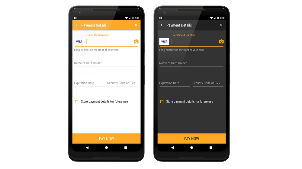
You can customize these styles or create your own style based on Checkout style. To apply the style declare it in the AndroidManifest.xml file within Checkout activity tag:
<activity
    android:name="com.oppwa.mobile.connect.checkout.dialog.CheckoutActivity"
    tools:replace="android:theme"
android:theme="@style/Theme.Checkout.Light"/>tools:replace="android:theme" attribute for the CheckoutActivity. It belongs to the Android tools namespace, so you must first declare this namespace in the <manifest> element: xmlns:tools="http://schemas.android.com/tools". Also if you use your custom style it must extend the Theme.Checkout style.You can quickly customize the checkout theme by overriding the checkout_color_accent. Simply add it to your color resources, for example:
<resources>
    <color name="checkout_color_accent">#29b6f6</color>
</resources>
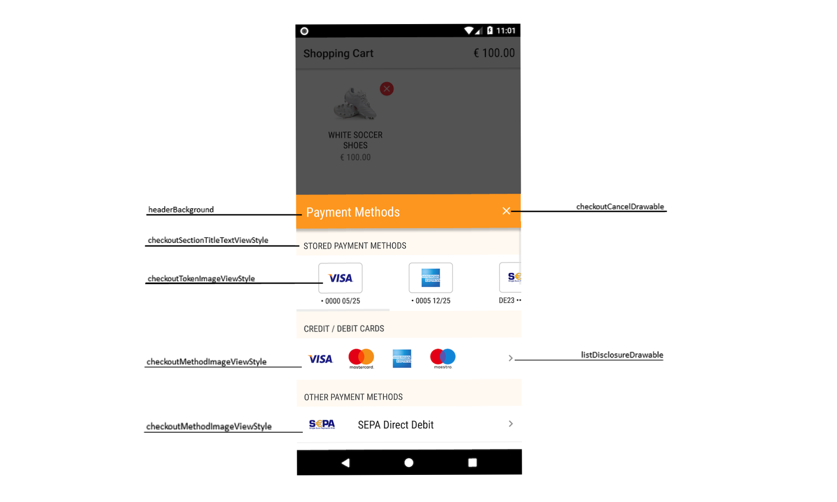
For deeper customization you can override any attributes from the predefined styles. See below the list of properties you can customize and how they change the checkout UI:
| Attribute Name | Type | Description |
|---|---|---|
| cancelButtonDrawable | reference | Using this attribute you can override the icon of cancel button |
| listDisclosureDrawable | reference | Using this attribute you can override the icon of list disclosure, i.e the arrow mark icon in front of every payment method in payment method selection screen |
| listMarkDrawable | reference | The mark of selected list item |
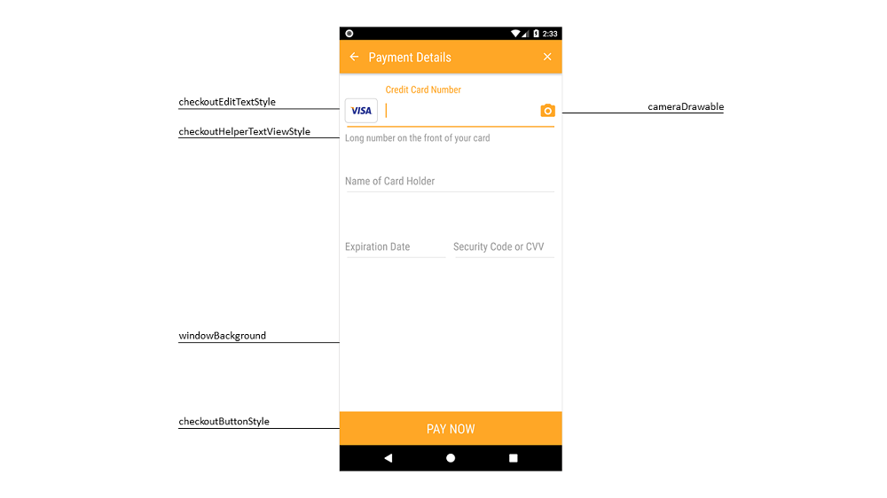
| cameraDrawable | reference | Using this attribute you can chnage the camera icon shown on card number input filed, you can refer below screen shot |
| cancelButtonTintColor | color | Using this attribute you can chnage the tint color of cancel/close button |
| listDisclosureTintColor | color | Using this attribut you can change the color of arrow mark icon, which is in front of every payment method |
| listMarkTintColor | color | The color of list item mark drawable |
| cameraTintColor | color | This attribute changes the color of camera icon on Card details input screen. |
| headerBackground | color|reference | The header background, you can use color or image for this |
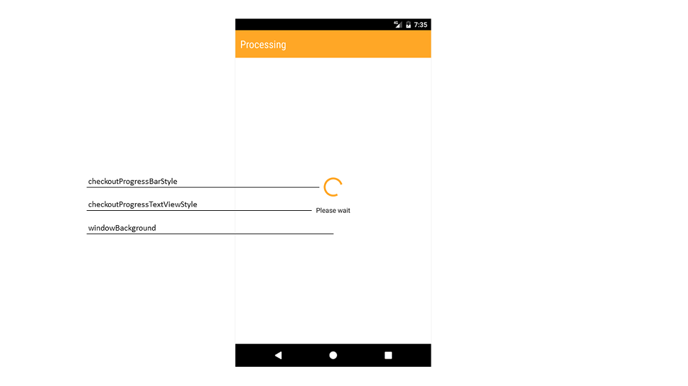
| windowBackground | color|reference | The window background, you can use color or image for this |
| checkoutTextViewStyle | reference | The base style of checkout text view |
| checkoutHelperTextViewStyle | reference | The style of helper text view |
| checkoutSectionTitleTextViewStyle | reference | The style of payment list section title. For example "Stored Payment Methods" |
| checkoutProgressTextViewStyle | reference | You can change the style of testview which is used to show a message below loading indicator, you can refer below screenshot to get more idea. |
| checkoutEditTextStyle | reference | The base style of checkout edit text |
| checkoutTokenImageViewStyle | reference | The style of payment token icon image view |
| checkoutMethodImageViewStyle | reference | Using this attribute you can change the style of payment brand icon image view in payment method selection screen. |
| checkoutButtonStyle | reference | The style of pay button |
| checkoutListViewStyle | reference | The style of list view |
| paymentMethodListItemSelector | reference | The selector for the payment methods list |
| checkoutProgressBarStyle | reference | The style of progress bar |
| paymentMethodListDividerColor | color | Using this attribut you can override the divider color in list of payment method selection screen. |
| typeface | string | The name of the .ttf font file placed in assets/fonts directory This name does not include file extension You can add this attribute to any view style |
Here is an example of the custom style based on Checkout.Light style. You can add it in your /res/values/styles.xml file
<style name="NewCheckoutTheme" parent="Theme.Checkout.Light">
    <item name="headerBackground">@color/checkout_header_color</item>

    <item name="cancelButtonTintColor">@android:color/black</item>
    <item name="listMarkTintColor">@color/accent_color</item>
    <item name="cameraTintColor">@color/accent_color</item>
    <item name="checkboxButtonTintColor">@color/accent_color</item>

    <item name="paymentMethodListItemSelector">@drawable/checkout_list_item_selector</item>

    <item name="checkoutButtonStyle">@style/NewCheckoutTheme.Button</item>
</style>

<style name="NewCheckoutTheme.Button" parent="Checkout.Button.Light">
    <item name="android:background">@color/accent_color</item>
</style>