Payment Overview
Overview
The Payment Overview page provides a high-level summary of transaction activity and performance across the selected reporting scope.
Figure 1: Entity selection and payment filters

Reports can be filtered by organizational entities and payment attributes to focus the analysis on specific areas of the business. Available entities depend on the user's position within the organizational hierarchy.
- PSP
- Division
- Merchant
- Channel
Entity selection defines the reporting scope, while payment filters allow users to further narrow the analysis to specific payment providers, payment types, payment brands, payment methods, and customer countries.
The dashboard supports normalized currency reporting and period-over-period comparisons to help identify transaction trends and performance changes over time.
- Currency (Normalized EUR) unifies transaction values across merchant accounts.
- View By displays results by transaction volume or transaction value.
Figure 2: Payment filters and transactions overview
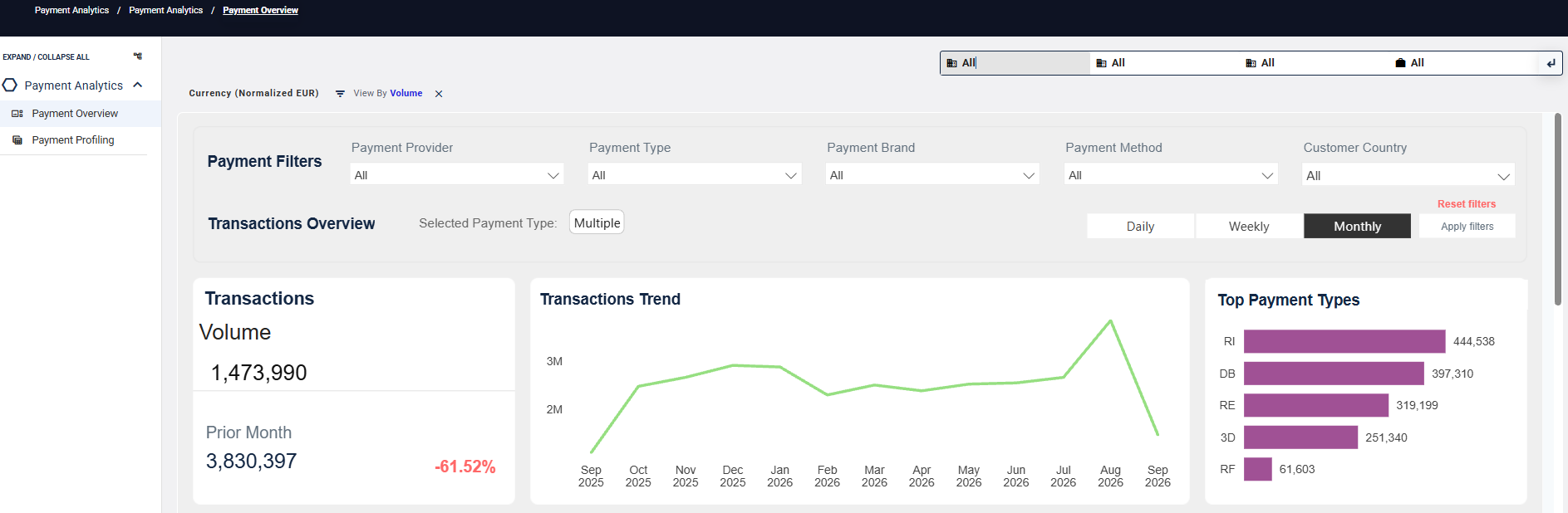
Payment Filters allow analysis to be narrowed to specific payment criteria.
- Daily, Weekly, and Monthly views provide comparative trend analysis over time.
- Transactions Overview presents transaction volume, trends, and top payment types for the selected reporting period.
Authorization Health
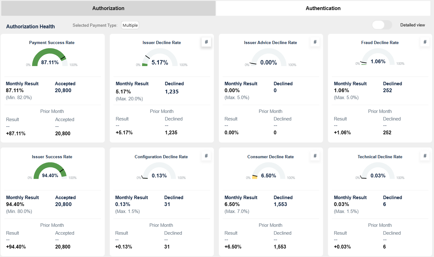
Authorization Health provides insight into platform performance and helps identify the root causes of acceptance gaps.
Compare Platform and Issuer success rates to identify potential revenue leakage. Decline metrics help determine the underlying causes of acceptance gaps and support further performance analysis.
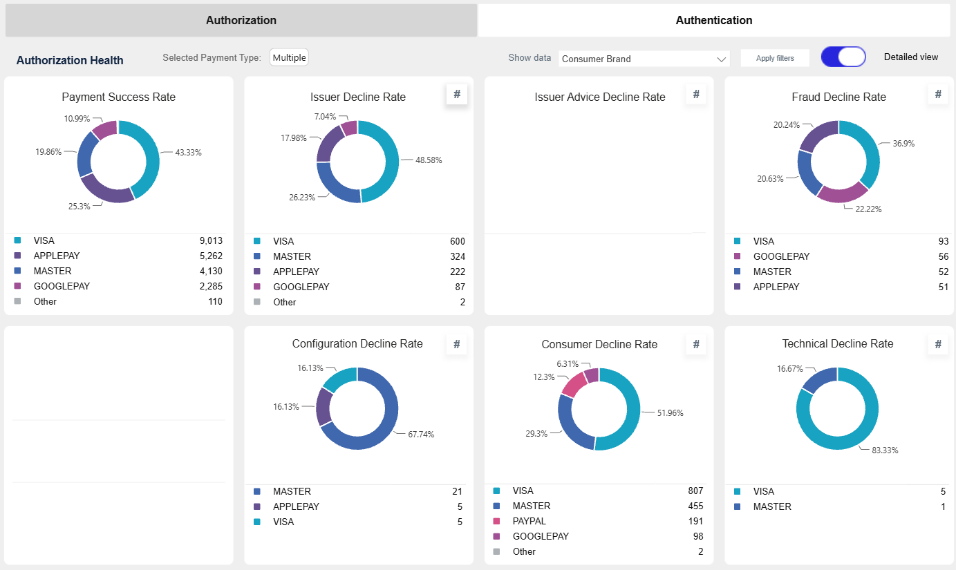
Use the available filters and the Detailed View option to analyze results by dimensions such as Consumer Brand and Stored Credential Type.
Figure 3: Authorization Health dashboard
Key Authorization Metrics
| Metric | Thresholds | Definition | Description | |
|---|---|---|---|---|
 |
Payment Success Rate (PAAR) | Green ≥ 82% Amber 75–81% Red < 75% |
(00.xx + 90.xx) / total tx | Shows overall platform health at a glance. |
 |
Issuer Decline Rate | Green ≤ 10% Amber 10–20% Red > 20% |
(60.95 + 59.94) / total tx | Shows issuer-driven declines. |
 |
Issuer Advice Decline Rate | Green ≤ 2% Amber 2–5% Red > 5% |
76.xx / total tx | Shows declines triggered by MAC control. |
 |
Fraud Decline Rate | Green ≤ 2% Amber 2–5% Red > 5% |
65.xx / total tx | Identifies fraud-related declines. |
 |
Issuer Success Rate (IAAR) | Green ≥ 90% Amber 80–89% Red < 80% |
(00.xx + 90.xx) / issuer volume | Shows issuer acceptance performance. |
 |
Configuration Decline Rate | Green < 0.5% Amber 0.5–1.5% Red > 1.5% |
70.xx / total tx | Highlights configuration and integration issues. |
 |
Consumer Decline Rate | Green ≤ 3% Amber 3–7% Red > 7% |
(80.xx etc.) / total tx | Shows user-related failures (3DS, timeouts, cancellations). |
 |
Technical Decline Rate | Green < 0.5% Amber 0.5–1.5% Red > 1.5% |
(40.xx etc.) / total tx | Highlights system and technical issues. |
Detailed View
The Detailed View allows authorization metrics to be analyzed across different reporting dimensions. In this example, the results are grouped by Consumer Brand.
Figure 3a: Authorization Health detailed view by Consumer Brand
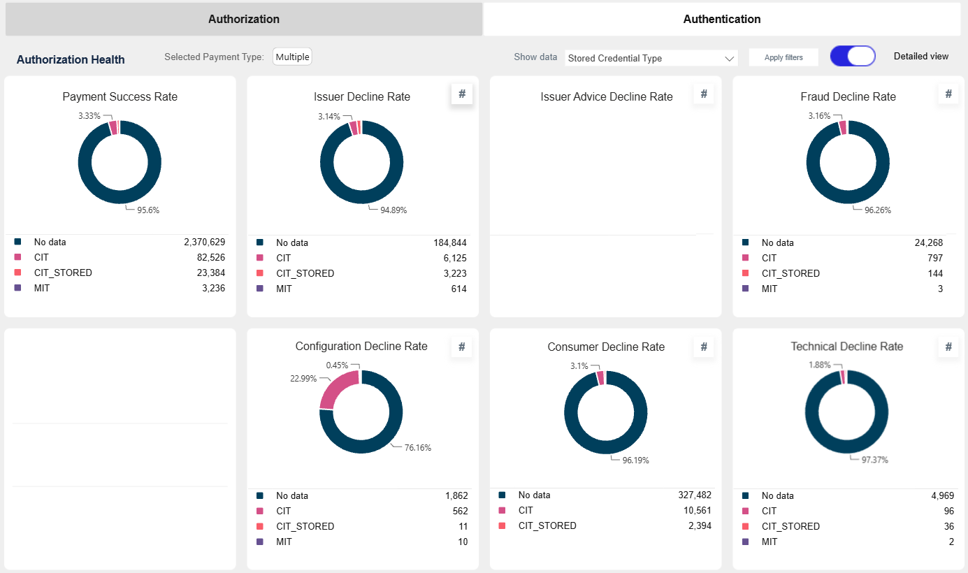
The Detailed View can also be used to analyze authorization metrics by Stored Credential Type, providing additional insight into acceptance and decline patterns.
Figure 3b: Authorization Health detailed view by Stored Credential Type
Authorization Trend
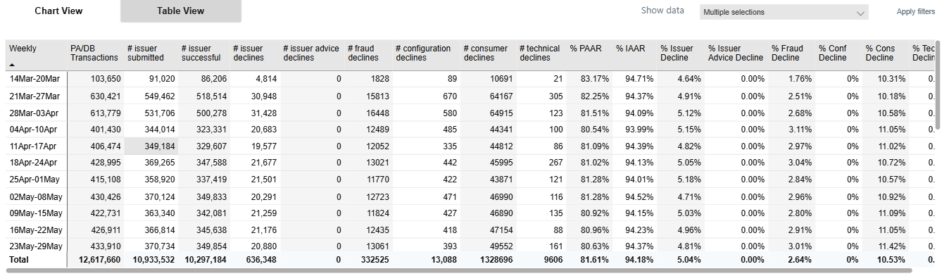
The Authorization Trend shows how success and decline rates evolve over time.
Figure 4: Authorization trend (chart)
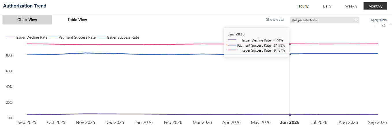
Figure 5: Authorization trend (table)
Authentication Health
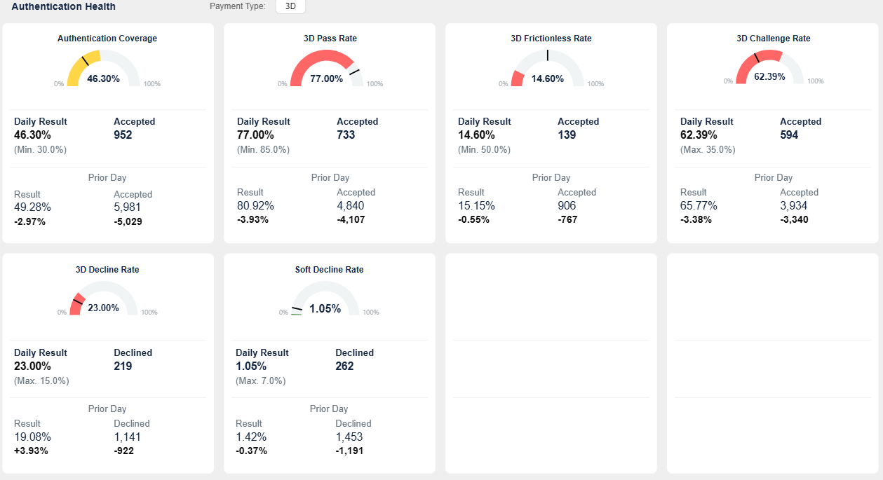
Authentication Health provides visibility into authentication performance and 3DS behavior.
Figure 6: Authentication Health dashboard
Key Authentication Metrics
| Metric | Thresholds | Definition | Description |
|---|---|---|---|
| 3D Challenge Rate | Green < 25% Amber 25–35% Red > 35% |
Challenge success / total 3D | Lower values indicate better performance. |
| 3D Decline Rate | Green ≤ 10% Amber 10–15% Red > 15% |
Failed authentications / total 3D | Shows failed authentication attempts. |
| 3D Frictionless Rate | Green ≥ 65% Amber 50–65% Red < 50% |
Frictionless success / total 3D | Higher values indicate better UX. |
| 3D Pass Rate | Green ≥ 90% Amber 85–90% Red < 85% |
Successful / total 3D | Total authentication success rate. |
| Authentication Coverage | Green 60–95% Amber 30–60% or >95% Red < 30% |
Auth present / total transactions | Indicates adoption of authentication. |
| Soft Decline Rate | Green ≤ 3% Amber 3–7% Red > 7% |
Soft declines / total transactions | Shows retry or authentication-triggered declines. |
Authentication Trend
The Authentication Trend shows how authentication metrics evolve over time.
Figure 7: Authentication trend (chart)
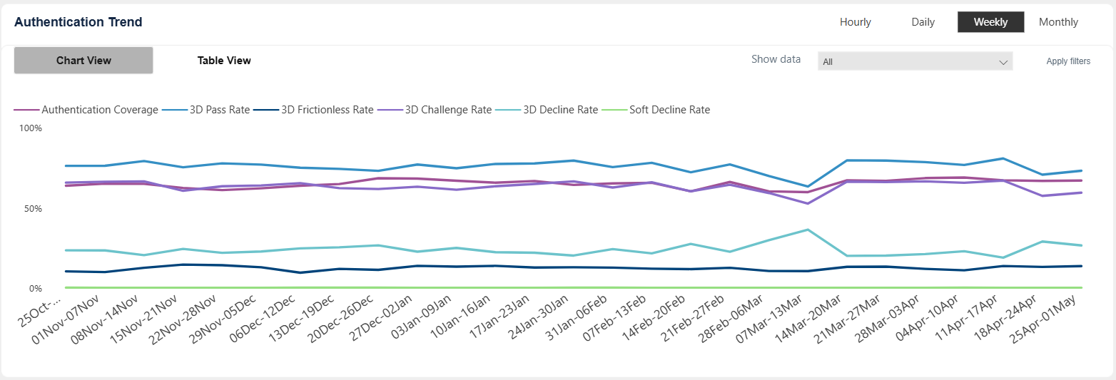
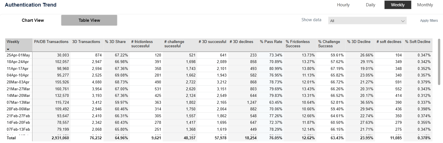
Figure 8: Authentication trend (table)